WEEK 5
Week 5
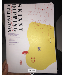
Week 5 was all about development again and touching up finished work. From my Discover Wellington page came about my new colour scheme of pink, blue, red and a dash of yellow. To me this spoken fun and young, which is what everyone wants to feel when they are skinny dipping.


Week 5 was all about development again and touching up finished work. From my Discover Wellington page came about my new colour scheme of pink, blue, red and a dash of yellow. To me this spoken fun and young, which is what everyone wants to feel when they are skinny dipping.


After speaking with my tutors it was apparent that my icons weren't working. I incorporated the use of circles into my design except for separately.
Vulnerable-
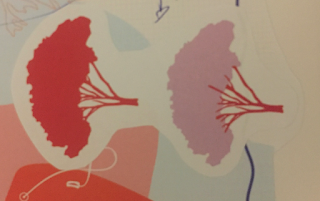
the openness of the location, how vulnerable you will be to the outside world.
Shrinkage -
whether the water is cold and how much nake people might shrink down there.
Illegal / Legal -
depending on location

Change of symbol.
I changed the symbol from a flax bush to a tree to represent Akatarawa as the location is surrounded by many trees. The symbol is slightly easier to see an not as dainty.

Development of Map

Sports and Rec page

Back page
I really enjoy the use of large text over the back to emphasise the website they must visit.


Comments
Post a Comment