WEEK 6
Final WEEK
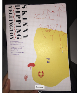
Week 6 consisted of touching up everything and printing the booklet.
Front cover
Discover wellington and Final map
Facts and Sports and Rec
DPS'S
Back page
The use of my own images:
Rationale
- What was your topic? - My topic was Skinny Dipping
- What were the relevant rationale and emotive qualities/attitude/atmosphere you wanted to convey? - I wanted to produce a sleek but cheeky/fun design to my brochure. I wanted to convey youth and fun and a bit of daringness.
- How does the visual language, application of grid and typographic approach achieve this? - I used an 8x6 grid to ensure harmony within my design. nit also to spread my illustration throughout my grid to break it. To give controlled madness. The bold type and colours give off the element of fun.
- What did you learn about your own process (positive and/or negative—we love reflection!) and how will this inform your approach to future projects? - Personally, I found that in a project I just need to start and from there my decisions flow. Researching is really important and should be done first. Screenshot all of your work as you do to show development and improvement. Ensuring the links to your images are there so nothing gets lost and my type is on every computer before opening my document. I need to look at every single detail of my design before printing. In all, I enjoyed the process and learned a lot about my illustrative skills and my design feel but these can always be expanded and developed
I have an online workbook with heaps of ideas: https://www.pinterest.nz/lemonhearts/design-me/


Comments
Post a Comment